

When choosing lighting for a ceramic tile showroom, one specification appears again and again:
CRI 90 or CRI 95?
At first glance, the answer seems simple. A higher number should mean better color quality.
But for professional tile displays, the real answer is more nuanced.
A CRI 95 fixture can provide excellent color fidelity, but that does not automatically mean it will always perform better than a well-designed CRI 90 fixture in every showroom.
The visual result also depends on:
- spectral quality;
- R9 performance;
- color temperature;
- زاوية الشعاع؛;
- optics;
- التحكم في الوهج؛;
- الإضاءة العمودية؛;
- tile surface finish;
- lighting position;
- color consistency between fixtures.
So, should a tile showroom specify CRI 90 or CRI 95?
The short answer is:
CRI 90 is sufficient for many professional ceramic tile showrooms, while CRI 95 is especially valuable for premium displays, subtle material colors and projects where highly accurate color evaluation is a priority.
This guide explains the difference in practical terms.
What Does CRI Mean?
CRI stands for مؤشر تجسيد اللون.
It describes how closely colors under an artificial light source appear compared with a reference illuminant.
The general CRI value, commonly written as Ra, is traditionally calculated from a group of test colors.
A higher number generally indicates better average color fidelity.
In commercial lighting, you will often see:
- CRI 80;
- CRI 90;
- CRI 95;
- CRI 97+.
For ordinary circulation areas, CRI 80 may be acceptable.
For ceramic tile, stone, bathroom and retail display environments, however, color accuracy becomes more important because customers are judging materials visually.
That is why CRI 90 or higher is usually the more appropriate starting point for tile showroom lighting.
However, CRI should not be treated as a complete description of color quality.
The Illuminating Engineering Society has specifically noted that modern LED sources can have very different spectral characteristics even when they achieve similar CRI values. IES therefore recommends a more comprehensive approach using TM-30 when detailed color rendition matters.
CRI 90 vs CRI 95: The Basic Difference
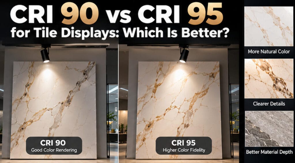
The numerical difference is only five points, but the visual difference can matter in some applications.
CRI 90
CRI 90 lighting generally offers very good color fidelity and is widely suitable for professional commercial environments.
In a ceramic tile showroom, CRI 90 can perform well for:
- standard porcelain tiles;
- matte ceramic;
- grey collections;
- cement-look surfaces;
- conventional marble patterns;
- wall and floor tile displays;
- general showroom illumination.
For many commercial projects, a good-quality CRI 90 source provides an excellent balance between color rendering, efficiency and cost.
CRI 95
CRI 95 lighting generally provides tighter average color fidelity to the reference source.
It may be especially useful for:
- premium marble-effect porcelain;
- beige and off-white materials;
- subtle stone colors;
- decorative tiles;
- natural-material imitation;
- high-end sintered stone;
- luxury bathroom displays;
- showrooms where designers compare small color differences.
The main advantage is not simply that the tile looks “brighter.”
The advantage is that subtle color relationships are more likely to appear closer to their intended appearance.
Does CRI 95 Make Tiles Look Better?
Sometimes.
But “better” needs to be defined carefully.
A higher CRI can help preserve subtle colors, but there are at least three different goals in showroom lighting:
- Color fidelity — making the material appear close to a reference.
- Color preference — making the material visually attractive.
- Color vividness — making certain colors appear more saturated.
These are not exactly the same thing.
IES TM-30 separates color fidelity from gamut and saturation-related behavior. This is important because a source can have high fidelity without necessarily making colors appear more vivid, and a source designed to increase vividness can sometimes shift colors away from strict accuracy.
For tile showrooms, this means:
The highest CRI is not automatically the most visually attractive option.
The right choice depends on whether your priority is technical color matching, merchandising appeal or a balance of both.
Why Tile Showrooms Are More Sensitive to Color Rendering
Ceramic and stone displays contain many low-saturation colors.
Common tile collections include:
- warm white;
- cool white;
- ivory;
- sand;
- cream;
- taupe;
- beige;
- light grey;
- charcoal;
- travertine tones;
- subtle marble veining.
The difference between two products may be small.
A customer comparing two beige porcelain tiles may not be looking for dramatic color.
They are looking for a subtle difference in warmth.
Poor-quality lighting can compress these differences and make multiple products appear too similar.
High-quality color rendering helps maintain the distinction.
That is one reason CRI 90+ is more important in a material showroom than in many ordinary commercial spaces.
CRI 90 Is Often Enough for General Tile Displays
It is important not to overspecify lighting unnecessarily.
For many ceramic showrooms, a well-designed CRI 90 system is already capable of delivering excellent results.
If the project uses:
- high-quality LED sources;
- good color consistency;
- appropriate beam angles;
- correct aiming;
- controlled glare;
- suitable CCT;
- proper vertical illumination;
then moving from CRI 90 to CRI 95 may produce only a subtle improvement in some areas.
This is particularly true for:
- large general display areas;
- circulation zones;
- standard tile racks;
- lower-priority collections;
- back-of-showroom sample areas.
In these applications, investing in better optics or better lighting layout may produce a larger improvement than simply increasing CRI.
When CRI 95 Is Worth Considering
CRI 95 becomes more valuable when color accuracy itself is part of the selling experience.
1. Premium Marble-Look Tiles
Marble-look porcelain often contains:
- warm veins;
- cool veins;
- subtle brown tones;
- gold accents;
- off-white backgrounds.
If these tonal differences are important to the product positioning, higher fidelity may improve presentation.
2. Beige and Neutral Collections
Neutral colors are surprisingly difficult.
A beige tile can shift toward:
- yellow;
- pink;
- grey;
- green;
- brown.
Small spectral differences in the light source can change how these materials are perceived.
For premium neutral collections, CRI 95 can provide added confidence.
3. Designer Showrooms
Architects and interior designers often compare materials side by side.
These customers may be more sensitive to subtle color differences than general retail visitors.
Higher-fidelity lighting can support material selection.
4. Flagship Stores
A flagship showroom is not just a sales environment.
It represents the brand.
If the showroom is designed to communicate premium materials and high product quality, higher color-rendering performance may be justified.
5. Sintered Stone and Large Slabs
Large-format sintered stone often contains complex surface patterns.
When these products are presented as premium architectural materials, CRI 95 can complement high-quality vertical lighting and specialized slab illumination.
The Important Detail: CRI 95 Does Not Guarantee Excellent Lighting
This is one of the most important points in this article.
Two luminaires labeled CRI 95 can still look different.
لماذا؟
Because CRI is an average metric.
It does not completely describe how every color is rendered.
A source may perform strongly on the average while being weaker in a specific part of the spectrum.
For this reason, professional buyers should not evaluate a fixture only from the Ra number.
When possible, also ask for:
- R9;
- TM-30 Rf;
- TM-30 Rg;
- spectral power distribution;
- MacAdam / SDCM color consistency;
- actual sample testing.
IES recommends TM-30 as a more complete approach because it evaluates color fidelity using a much larger set of color samples and also provides information about gamut and hue shifts.
What Is R9 and Why Does It Matter?
R9 measures the rendering of strong red.
It is not included directly in the traditional eight-sample Ra average, which means two fixtures with the same CRI can have different red performance.
For ceramic tiles, R9 is relevant when displays contain:
- reddish marble veining;
- terracotta;
- warm wood-effect tiles;
- copper tones;
- warm beige;
- red-brown stone;
- decorative bathroom materials.
A fixture with high Ra but weak red rendering can make warm colors appear less rich.
Therefore, when comparing two high-CRI fixtures, asking for the R9 value can be useful.
Why TM-30 Is Better for Professional Specification
CRI remains useful because it is simple and widely understood.
However, modern LED technology gives manufacturers much more control over spectral output than older light sources.
This means two LED products can achieve the same CRI while producing different visual results.
TM-30 was developed to provide more detailed information.
The main measures include:
Rf — Fidelity Index
Rf describes how closely colors match the reference source.
A higher Rf generally means less average color shift.
Rg — Gamut Index
Rg describes average saturation changes.
Approximately:
- Rg around 100 means similar average saturation;
- above 100 generally indicates increased saturation;
- below 100 generally indicates reduced saturation.
Color Vector Graphic
TM-30 can also show which hue regions shift in saturation or hue.
For high-end retail applications, IES has published examples where high color fidelity criteria may reach Rf ≥95, demonstrating that premium retail specifications can go beyond simple CRI requirements.
That is useful for tile showrooms because the goal is not merely to achieve a number—it is to understand how the light interacts with actual materials.
CRI 90 vs CRI 95 for Different Tile Types
| Tile Type | CRI 90 | CRI 95 | Recommendation |
|---|---|---|---|
| Standard porcelain | Excellent | Excellent | CRI 90 usually sufficient |
| Matte ceramic | Excellent | Excellent | CRI 90 usually sufficient |
| Grey concrete-look tile | Excellent | Slight improvement | CRI 90 generally enough |
| Beige / ivory tile | Very good | Better for subtle tones | Consider CRI 95 |
| Marble-effect porcelain | Very good | Better for fine veining | CRI 95 preferred for premium displays |
| Wood-look ceramic | Very good | Better warm-tone fidelity | 90–95 depending on positioning |
| Decorative tile | Very good | Stronger premium presentation | CRI 95 often worthwhile |
| Sintered stone | Very good | Excellent | CRI 95 for high-end galleries |
| Terracotta / warm tones | Good to very good | Better if R9 is strong | Check R9, not CRI alone |
| Large neutral slabs | Very good | Excellent | 95 for designer / flagship environments |
Does Higher CRI Reduce LED Efficiency?
Historically, higher color rendering could involve some trade-off in luminous efficacy because producing a broader or more balanced spectrum may reduce lumens per watt.
Modern LED technology has improved significantly, so the efficiency difference is often manageable.
However, buyers should still compare actual product data rather than assuming two wattages perform identically.
For example, when comparing a CRI 90 and CRI 95 version, check:
- lumen output;
- efficacy;
- wattage;
- thermal performance;
- lifetime;
- optical efficiency.
A higher CRI fixture that produces insufficient useful illumination may not be the best solution.
For tile showrooms, quality of light and useful vertical illumination matter more than headline lumen output alone.
CRI 90 vs CRI 95: Cost Considerations
CRI 95 LED chips and selected premium binning can cost more than standard CRI 90 alternatives.
But the more important question is not:
“How much more does CRI 95 cost?”
The better question is:
“Where in the showroom does CRI 95 create enough visual value to justify the cost?”
A smart project does not always need CRI 95 everywhere.
For example:
Use CRI 95 in:
- flagship display walls;
- hero collections;
- premium stone-look tiles;
- designer consultation areas;
- marble-effect displays;
- high-end bathroom scenes.
Use CRI 90 in:
- general sample racks;
- circulation areas;
- secondary displays;
- non-critical background zones.
This mixed approach can improve visual quality without unnecessarily increasing the entire project budget.
Color Temperature Still Matters
A CRI 95 fixture at the wrong color temperature can still make the showroom feel incorrect.
For example:
A high-CRI 3000K source may accurately render colors relative to its reference, but it will still create a warmer visual environment than 4000K.
Therefore, CRI and CCT must be considered separately.
For ceramic tile displays:
- 3000 كلفن can support warm stone, wood and residential concepts;
- 3500 كلفن offers a balanced environment for mixed collections;
- 4000 كلفن can suit cool grey, white and contemporary materials.
Do not choose CRI first and assume the rest will take care of itself.
Lighting Layout Can Matter More Than CRI
This is another point that is frequently overlooked.
Imagine two showrooms.
Showroom A
- CRI 95;
- poor beam angle;
- strong glare;
- uneven tile walls;
- dark lower sections;
- badly positioned fixtures.
Showroom B
- CRI 90;
- good optics;
- proper vertical illumination;
- controlled glare;
- correct aiming;
- appropriate color temperature.
In many cases, Showroom B will provide the better visual experience.
Color rendering is only one part of professional lighting.
That is why SUNPOL’s حلول إضاءة صالات عرض البلاط consider color quality together with beam angle, vertical illumination, glare and flexible aiming.
For a broader explanation of these factors, see our guide to أفضل إضاءة لصالات عرض البلاط الخزفي.
Should a Tile Showroom Specify CRI 97 or CRI 98?
It can, but higher is not always necessary.
Above CRI 95, improvements may become increasingly subtle for many users.
Extremely high color fidelity may be valuable in:
- color-critical studios;
- museums;
- luxury design galleries;
- specialist material-matching environments.
But ordinary ceramic showrooms should evaluate whether the additional cost produces a meaningful commercial benefit.
Again, testing real materials is more useful than choosing a specification purely because the number is higher.
How to Test CRI 90 vs CRI 95 in a Real Showroom
The best comparison is a physical mock-up.
Use two fixtures with:
- the same CCT;
- similar beam angle;
- similar lumen output;
- similar installation position.
Then test them on the same materials.
Include:
- white porcelain;
- beige tile;
- grey stone;
- marble-look tile;
- wood-effect tile;
- polished porcelain;
- matte ceramic;
- sintered stone if available.
Ask several observers to compare:
- color accuracy;
- warmth;
- surface richness;
- veining;
- material depth;
- visual comfort.
You may find that the difference is obvious on some materials and barely visible on others.
That information can help you decide where CRI 95 is worth using.
A Better Specification Than “CRI 95 Only”
For a premium ceramic tile showroom, a stronger specification might include:
- CRI Ra ≥90 or ≥95 depending on zone;
- high R9 where warm materials are important;
- specified CCT;
- tight color consistency;
- TM-30 data where available;
- suitable beam angle;
- controlled glare;
- required lumen output;
- dimming compatibility;
- actual material mock-up.
This approach is much more reliable than selecting a fixture simply because a catalogue says “CRI 95.”
How SUNPOL Selects Color Quality for Tile Displays
SUNPOL approaches ceramic showroom lighting from the material side rather than treating CRI as an isolated number.
The lighting specification can vary according to:
- tile color;
- surface finish;
- texture;
- slab size;
- display orientation;
- showroom level;
- customer profile.
For standard display areas, high-quality CRI 90 lighting can often provide excellent results.
For premium material collections, designer showrooms or subtle neutral products, higher-fidelity options can be considered.
SUNPOL combines color rendering with:
- adjustable track lighting;
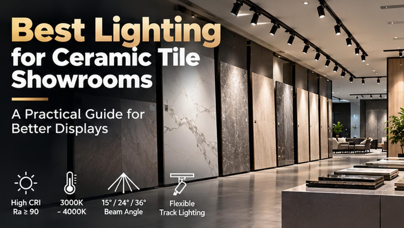
- 15° / 24° / 36° beam options;
- الإضاءة العمودية؛;
- التحكم في الوهج؛;
- large-format slab lighting;
- flexible showroom layouts.
This is particularly important because even excellent spectral performance cannot compensate for poor optical design.
You can explore SUNPOL’s من إضاءة المسار التجارية or review the full tile showroom lighting solution for different display applications.
CRI 90 vs CRI 95: Final Recommendation
So, which is better for ceramic tile displays?
There is no universal winner.
Choose CRI 90 when:
- the showroom is primarily general commercial display;
- budget efficiency matters;
- tile colors are relatively straightforward;
- high-quality optics and layout are already provided;
- material matching is not highly color-critical.
Choose CRI 95 when:
- subtle color fidelity is important;
- premium marble or stone collections are featured;
- designers regularly compare materials;
- the showroom represents a premium brand;
- the project prioritizes visual accuracy over minimum cost.
For many projects, the best strategy is not choosing one or the other for the entire building.
بل هو using CRI 95 selectively where color accuracy creates the most value and CRI 90 where it already performs the job well.
Most importantly, do not evaluate lighting from CRI alone.
For a professional tile showroom, the final result comes from the combination of:
color quality + optics + beam angle + glare control + vertical illumination + material testing.
That combination matters far more than any single number printed on a specification sheet.
Frequently Asked Questions
Is CRI 95 noticeably better than CRI 90?
Sometimes. The difference is often most noticeable in subtle neutral colors, marble veining, warm tones and premium decorative materials. In general display areas, the improvement may be relatively small.
Is CRI 90 good enough for tile showrooms?
Yes. A high-quality CRI 90 LED can be an excellent choice for most ceramic tile showroom applications when combined with good optics and lighting design.
Should premium tile showrooms use CRI 95?
It is often worth considering, particularly for flagship displays, high-end porcelain, marble-look products, designer areas and sintered stone.
Is CRI 95 always better?
Not necessarily. A poorly designed CRI 95 fixture can produce worse visual results than a high-quality CRI 90 product with better spectral balance, optics and glare control.
What is more important: CRI or R9?
They describe different things. CRI Ra is an average fidelity metric, while R9 describes strong red rendering. For warm-toned materials, both can matter.
What is TM-30?
TM-30 is a more comprehensive method for evaluating color rendition. It includes fidelity, gamut and hue-specific information, providing more detail than traditional CRI alone.
الخاتمة
CRI 90 and CRI 95 are both suitable for professional ceramic tile displays.
The difference is mainly about how demanding the visual application is.
For standard commercial showrooms, CRI 90 provides very good color quality.
For premium displays where subtle material colors, veining and tonal accuracy influence purchasing decisions, CRI 95 can provide additional value.
But the most important principle is simple:
Do not buy a number. Evaluate the light on the material.
إنّ best tile showroom lighting is the system that allows customers to understand the ceramic surface accurately, comfortably and confidently.